Art & drawing · Writing & language
Comics making
Almost everything written about making comics is really about drawing, and drawing is the part of this craft that has the most instruction and the least mystery. What decides whether a page works is the sequence: which moments you choose, what you leave in the gutter between panels, and how the eye is walked across a page it can see all at once. That is a distinct skill, it is not taught by anatomy tutorials, and it is what this page is about. It also covers the parts that quietly sink projects — lettering, page setup and finishing something short — because the commonest outcome in this hobby is not a bad comic but an unfinished one.
Also known as comic drawing, graphic novels, manga making, sequential art, zine comics.
A comic is a story told in a sequence of images the reader moves through at their own pace. That definition is doing more work than it looks: the reader controls the clock, and they can see the whole page at once. Those two facts are the entire reason comics are a distinct medium rather than illustrated prose or a stalled film, and almost every craft decision here follows from them.
The consequence is that the central skill is not drawing. It is choosing which moments to show and trusting the reader to supply what happens between them. A reader shown a raised hammer and then a bent nail has watched the blow land — you did not draw it, and drawing it would have made the sequence worse. Learning what to leave out is the whole discipline, and it is close to invisible when it is done well, which is why so little of the available instruction is about it.
The second consequence is the page. Because a reader takes in the shape of a page before they read a word of it, panel size, arrangement and what sits at the bottom right are pacing tools. A wide panel reads slower. A page turn is the only genuinely hidden moment in the medium and is where surprises belong. None of this requires any drawing ability at all, and all of it can be practised with boxes and stick figures.
- The actual skill
- Sequence, not rendering
- Who controls pace
- The reader, always
- Cheapest real start
- Paper, pencil, fineliner
- Commonest failure
- Unfinished, not bad
- First project
- Four to eight pages
Step 1: Pick something small and finishable
A single incident with a beginning and an end, four to eight pages. Not a world, not a cast, not chapter one. The aim of the first project is to get through every stage of the process once, and length is the only thing that reliably stops that happening.
Step 2: Write it as a list of moments, not as a script
One line per panel, describing what is seen. Doing this before drawing anything exposes the pacing while it is still cheap to change — and it will show you immediately that you have too many panels, which everybody does.
Step 3: Thumbnail the whole thing at postage-stamp size
Tiny, fast, ugly boxes for the entire comic on one or two sheets. Small enough that you cannot draw detail is the point: it forces you to judge the page as a shape and the sequence as a rhythm. This stage is where a comic is actually made and it takes an hour.
Step 4: Letter before you finish the art, not after
Place the balloons at the thumbnail or pencil stage. Lettering added at the end has to fit into space that was not left for it, which is why so many first comics have text covering a face. The balloons are part of the composition and reading order, not a layer on top of it.
Step 5: Pencil, ink and finish one page at a time
Take a single page all the way to finished before starting the next. It is slower in theory and far faster in practice, because it tells you within a day whether your approach works at all, rather than after you have pencilled thirty pages in a style you cannot ink.
Step 6: Show it to somebody who does not read comics
The only test that matters is whether a reader followed it. Ask them to tell you what happened, and listen for where they hesitated rather than for whether they liked it. Confusion about reading order or about who somebody is are the two faults worth fixing first.
The single most useful habit for somebody starting is to finish things that are too short. A completed four-page comic teaches more than sixty pages of an abandoned epic, because only the finished one contains an ending, and endings are the part nobody gets to practise.
A great deal of comics craft is expressible as rules with reasons, which makes it exactly the kind of thing that transfers in writing. What follows is that part. Drawing itself is not here, because it is served better by the enormous existing drawing literature and because it is not what makes a comic work.
- Reading order is a design responsibility — The reader follows a Z path in English-language comics, and anything that breaks it — a panel that sits ambiguously between two others, a balloon placed to the right of the one that should be read first — costs the reader a moment of confusion they will blame on themselves. Balloon placement decides reading order within a panel, so balloons are laid out before art, not after.
- Panel size is duration — A large panel is read for longer than a small one, and a row of narrow panels reads fast. This is the medium’s only real control over time and it is free. A page of six identical rectangles has deliberately given it up, which is occasionally the right choice and usually an accident.
- The page turn is the only hidden moment — Everything else on a spread is visible before it is read. What is over the page is not, which makes the turn the medium’s equivalent of a cut to black. Reveals, punchlines and shocks belong immediately after one, and putting them at the bottom right of a right-hand page throws them away.
- Cut every panel the reader could infer — The commonest structural fault in a first comic is redundancy: the character reaches for the door, opens the door, walks through the door. The gutter does that work. Cutting to the far side is not a shortcut, it is how the form reads, and the edit almost always improves pace and clarity at once.
- Establish, then move in — A reader who does not know where a scene is set will keep asking rather than following it. One wider panel early buys every close-up afterwards. This is the cheapest fix available for a page that feels claustrophobic without anybody being able to say why.
- Consistency beats quality for character — A reader needs to recognise somebody instantly, and they use silhouette, hair and clothing rather than facial likeness. Designing characters to be distinguishable in black shape alone solves more recognition problems than improving the faces does, and it works at any drawing level.
- Lettering is a craft, and bad lettering is loud — Even spacing, a consistent balloon shape, tails that point at the speaker without crossing, and text that does not touch the balloon edge. These are mechanical and learnable, and they are the difference readers register as "professional" without being able to name it.
- Paper — Smooth bristol board takes ink without feathering and is the one paper upgrade that visibly changes results. Cartridge paper is fine to learn on. Working larger than final print size and reducing is a traditional trick that hides a great deal of unsteadiness in the line.
- Pencils — Any. A non-photo blue pencil for underdrawing is genuinely useful because it can be dropped out when scanning, which removes the erasing stage entirely.
- Inking tools — Fineliners for control and consistency, a brush pen for line weight and life. Most people should own both and will settle on one. Dip pens and brushes are wonderful and are not a beginner’s problem to solve.
- A ruler and a light source — Panel borders drawn freehand read as sloppiness rather than as style at the beginning. A window works as a lightbox for transferring thumbnails.
- A drawing tablet — A small screenless tablet at £50–£90 is a complete digital setup with free software and is a bigger jump in capability per pound than anything else here. Screen tablets are lovely and are not necessary.
- Software — Free options are genuinely sufficient, and one widely used comics application is a modest one-off cost. What to look for is panel and page management, a stabiliser for line quality, and proper text tools — general painting software is weaker at exactly the comics-specific parts.
- What to ignore at the start — Screentone, complex colour workflows, expensive markers and a scanner. All of them are solutions to problems you will not have until you have finished several comics, and shopping for them is a well-known substitute for making one.
Progress in this craft is unusually easy to mistake, because the visible thing improving is the drawing and the thing that decides whether the comic works is not. It is worth tracking them separately.
- Finish, then finish again — The reliable measure of a first year is number of completed comics, not pages drawn. Four finished shorts is a better position than a hundred pages of an unfinished book, in every respect including the drawing.
- Read as a maker — Take a page you admire and count the panels, then work out why the panel sizes are what they are and what happens on the turn. Half an hour of this teaches more about sequence than a month of tutorials, and it is the only way most people ever notice the page turn being used.
- Copy a page exactly, once — Reproducing a page you like from a comic you own — layout, panel sizes, balloon placement — shows you the decisions from the inside. It is a study exercise rather than something to publish.
- Work to a deadline you did not set — An anthology call or a small press fair table date does more for output than any amount of intention. British comics has a healthy anthology culture that exists partly for this reason.
- Separate the roles deliberately — Draw somebody else’s script, or write for somebody else. It isolates the skills and it is the fastest way to find out that you are, for instance, a much better letterer than you assumed.
- Then, and only then, chase the long project — A graphic novel is a reasonable second-year ambition and a poor first-month one. The difference is that by then you know what a page costs you in hours, which is the number the whole plan depends on.
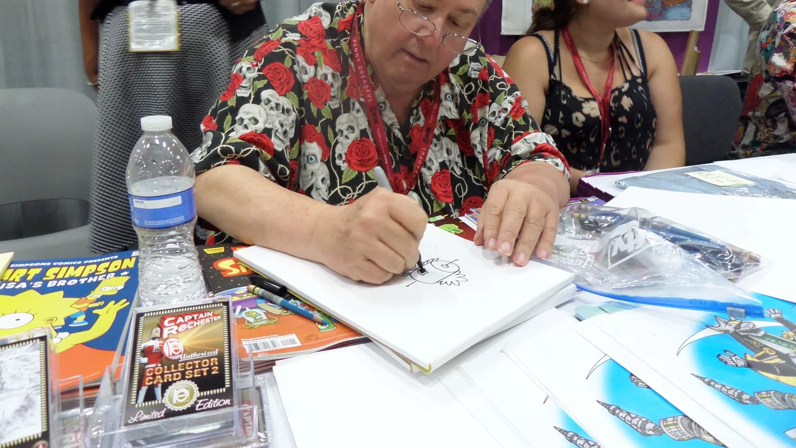
British comics culture is small, unusually welcoming and organised almost entirely around small press. Fairs and conventions run in most large cities, tables are cheap, and the normal way to enter is to turn up with something you made and a folding table. There is very little gatekeeping and almost no expectation that anybody is professional.
Anthologies are the other spine of it. Open calls for short comics on a theme run constantly, they take submissions from people with no track record, and they impose the deadline and the page limit that most makers need. Being in one is also how most people meet everybody else.
The etiquette worth knowing is straightforward. Credit everybody who worked on a comic, on the comic. Ask before adapting somebody else’s characters or story, and never sell it. Paying collaborators is expected the moment money is involved, and "exposure" is not a rate. Fan work and tributes are a healthy and accepted part of the culture; passing off traced or copied work as your own is the one thing that ends a reputation quickly, and it is noticed faster than newcomers expect.
- Short-form and one-page comics — A complete idea in one to eight pages. Where nearly everybody should start, where a great deal of the best work in the form lives, and the format that anthologies and small press fairs actually run on.
- The long-form graphic novel — A book-length work, usually a solo project over years. The ambition most beginners arrive with and the one most likely to be abandoned, for the ordinary reason that it postpones every lesson an ending teaches.
- Webcomics and serial publishing — Published in instalments online, on a schedule. A completely different craft problem: the unit is the update rather than the page, and the discipline is sustainability rather than scope. The most common route to an audience by a wide margin.
- Zines and small press — Self-published, short-run, photocopied or print-on-demand, sold in person. The tradition that most of British comics culture actually runs on, and the cheapest way to have a finished object and a reader.
- Manga and its conventions — Comics from Japan and the very large body of work made elsewhere using its storytelling grammar — right-to-left reading, a distinctive approach to pacing that spends far more panels on a moment, and its own genre vocabulary. Worth reading whichever tradition you work in.
- Strips and gag comics — Three or four panels, a setup and a turn, endlessly repeatable. The most rigorous training in economy available anywhere in the medium, and a form where drawing ability matters least of all.
- Collaborative comics — Writer, artist, letterer and colourist as separate people, which is how most commercially published comics are made. Genuinely worth trying early: it is the fastest way to discover which of the four you actually enjoy.
- Autobiographical and documentary comics — Non-fiction in the medium, from memoir to reportage. A large and serious part of the modern form, and the branch where plain drawing and strong sequence most obviously outperform virtuosity.
- Still deciding — Comics making vs fiction writing
- Starting with the graphic novel — The single most common way this hobby ends. A long project defers the ending, the lettering, the finishing and the feedback — every part that teaches you something — for a year or more. Almost nobody survives it as a first project and almost everybody tries.
- Drawing before thumbnailing — Rendering a page whose sequence has not been tested means the pacing problems are discovered when they are expensive to fix. An hour of tiny boxes prevents a fortnight of good drawings in the wrong order.
- Too many panels — Almost every first comic shows every step of every action. It reads slow and cluttered, and cutting a third of the panels usually fixes both without losing a single beat of the story.
- Lettering last — Balloons crammed into space that was not reserved for them, covering faces and forcing the reader’s eye backwards. The fix costs nothing and has to happen at the thumbnail stage.
- Inconsistent character design — A character who changes height, hairline or clothing between panels stops being a person and becomes a puzzle. Simplify the design until you can repeat it, rather than improving it until you cannot.
- Confusing reading order — Usually caused by an irregular panel layout attempted early. Grids are not boring, they are load-bearing, and breaking the grid works best when the reader has been given one to break.
- Waiting to be good enough to start — The rendering never arrives first. Sequence improves by making comics and nothing else improves it, so the first several are best treated as the cost of learning rather than as work.
A comic that is not working is almost always diagnosable from the reader’s behaviour rather than from the drawing. What follows reads the symptom backwards to the cause, which is the part text is genuinely good at — unlike the drawing itself, which it is not.
- The reader hesitated, or read a panel out of order — Reading order has broken. Look first at balloon placement, which sets order within a panel, and then at any panel that sits ambiguously between two others. Irregular layouts are the usual cause and the usual fix is to return that page to a grid.
- They asked who somebody was — Character design, not drawing quality. Check whether two characters share a silhouette, a hairline or a colour of clothing, and change one of those rather than trying to draw the faces better.
- It reads far faster than you expected — Usually uniform small panels, which give the eye no reason to slow. Widening one panel per page at the moment that should land is often the entire fix, and it costs no extra drawing.
- It drags, and you cannot say where — Count the panels that show a step the reader could have inferred. Cutting those almost always fixes pace, and the count is usually higher than the maker believes — a third is common on a first comic.
- The punchline or reveal fell flat — Check where it sits on the spread. If it is visible before the reader gets to it, it was spent. Move it to the first panel after a page turn, which is the only moment the medium can hide.
- The page feels cluttered even though the panels are simple — Usually text. Too many balloons, balloons touching their own edges, or captions duplicating what the art already says. Cutting dialogue the picture is already carrying is the cheapest improvement available.
- The scene feels claustrophobic — No establishing shot. One wider panel early buys every close-up after it, and its absence is the commonest cause of a sequence that feels airless without anybody being able to name why.
- You have stopped working on it — The most common failure in the craft and worth diagnosing rather than blaming. It is usually scope — a project long enough that the end is not visible — and the fix is to finish something four pages long instead, then come back.
- Panel
- A single framed image. The unit of the medium, and its size is a statement about how long the moment takes.
- Gutter
- The space between panels, where time passes and the reader does the work. The most important empty space in the craft.
- Thumbnail
- A tiny rough of a whole page or comic, made to test sequence and page composition before any drawing. Where the comic is really written.
- Splash page
- A single panel filling a whole page. Slows everything down and is spent rather than used — a comic with several has usually wasted them.
- Spread
- Two facing pages read as one image. Everything on it is visible at once, which is why it cannot hold a surprise.
- Balloon and caption
- A balloon holds speech or thought and belongs to a character; a caption sits outside and belongs to the narration. Mixing their functions is a common early muddle.
- Tail
- The pointer from a balloon to its speaker. Tails should not cross, which is a constraint on where characters can stand.
- Bleed
- Art running off the edge of the page. Reads as openness or as continuation beyond the frame, and requires setting up the page correctly for print before you draw.
- Inking
- Committing the pencil drawing to final line. Not tracing — line weight decisions made at this stage carry most of the depth and focus in finished black-and-white art.
- Screentone
- Patterned grey fills, originally adhesive sheets and now usually digital. A manga staple and a way to get tonal range without colour.
- Small press
- Self-published and independently published comics, and the fairs and shops that carry them. Where most people in Britain first sell something they made.
Sequential picture storytelling is very old, and comics as a form with its own grammar assembled during the nineteenth and early twentieth centuries as printing made mass reproduction cheap. The newspaper strip established economy and the recurring cast; the comic book established the long-form serial; and the conventions readers now use without noticing — the balloon, the caption, the panel border, the sound effect — settled in that period and have been remarkably stable since.
Britain’s own tradition ran heavily through weekly anthologies, which is why the short serialised instalment and the anthology remain so central to how comics are made here. The alternative and underground scenes of the later twentieth century broadened the subject matter enormously and, more consequentially for a hobbyist, normalised self-publishing: a photocopier and a stapler became a legitimate route to a readership.
Two changes shaped the present. Manga arriving in translation brought a different pacing grammar to a generation of readers and makers, and it is now as much a native influence as anything else. And the internet removed the printing and distribution barrier entirely, which is why the most common form of comics being made today is serialised, published directly, and made by somebody nobody commissioned.
- Do I need to be able to draw well to make comics?
- No, and this is the misconception that stops most people. Comics are read as a sequence, and clarity beats rendering by a wide margin — a reader has to know who that is, where they are and what just happened, and none of those requires good anatomy. A great deal of well-loved work in the form is drawn simply and deliberately so. What you do need is consistency, so a character is recognisable from panel to panel, and that is a much smaller ask than draughtsmanship.
- What actually goes in the gutter between panels?
- Whatever the reader can supply themselves, which is more than most beginners believe. The space between two panels is where time passes, and the reader closes it automatically — you show a hand on a door and then a room, and nobody needs the door opening. New makers almost always draw too many panels because they are afraid of being unclear, and the fix is to cut every panel the reader could have inferred. That single edit improves more first comics than any drawing advice.
- How long should my first comic be?
- Between four and eight pages, and the reason is not ambition management. A short comic forces every decision the form has — pacing, page turns, lettering, an ending — into a project you can finish in a fortnight, which means you get the whole loop once instead of the first tenth of it ten times. The commonest outcome in this hobby is an abandoned graphic novel with beautiful character designs and no story, and starting short is the reliable way not to produce one.
- Should I work on paper or digitally?
- Either, and the choice matters less than people expect. Digital wins on correction, lettering and preparing files for print, and it removes the tyranny of ruining a finished page at the last panel. Paper wins on cost, on not being on a screen, and on producing an object at the end. The practical answer for most people is a hybrid: thumbnail and pencil on paper because it is faster to think that way, then scan and letter digitally, because hand lettering is a craft of its own and bad hand lettering is the fastest way to make a good comic look amateur.
- What is the difference between a comic, a graphic novel and a manga?
- Length, format and origin rather than anything about the craft. "Graphic novel" describes a long comic in book form and is largely a bookshop category; manga is comics from Japan, read right to left, with a strong set of storytelling conventions that have been widely adopted elsewhere. The panel-to-panel skills are the same in all three, which is why it is worth reading widely across them rather than only in the tradition you want to work in.
- How do people actually publish comics?
- Most self-publish, and the small press route is genuinely accessible: a photocopied or short-run printed zine, sold at small press fairs and comic events or online, at a price that covers printing and not much else. Webcomics are the other main route and cost nothing but attention. Traditional publishing exists and is small, slow and competitive. The important thing for somebody starting is that none of it is gatekept — a finished eight-page comic can be in a reader’s hands within a month, and nobody’s permission is required.
If you like this
Each of these is here for a stated reason, not because it is also a hobby.
Easier way in
- Journaling — If the appeal is the daily habit and the record rather than the drawing, journaling gets there with no craft ladder in the way — and illustrated journals are where a good many comics makers actually started.
Similar to
- Miniature painting — Both are patient table crafts where a character has to read clearly at a glance, and both reward simplification over rendering far more than newcomers expect.
Goes well with
- Fiction writing — The story problems are the same and the constraint is not — a comic writer is choosing which moments to show rather than which words to use, and most people who do both say each improved the other.
- Game development — Both are about pacing a reader through something they control, and both live or die on finishing something small rather than starting something large.
Sources for this section
- Crafts Council (opens in a new tab) — Crafts Council · Institutional · could not be reached
Substantial
Last reviewed 2026-08-19. Cost, time and difficulty figures on this page are HobbyHQ estimates — see how we work. Something here wrong or out of date? Tell us.